 By Ethan Brooks
Updated November 2026
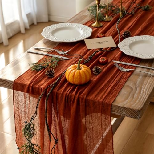
Looking for images of Thanksgiving decorations to get your fall styling started? This guide shows you how to use those photos as a planning tool: how to pick a color palette, match a style to your home, and turn a few reference pictures into a finished look. By the end, you will know which elements to copy, which to skip, and how to arrange them with your own pieces.
Start With a Clear Color Palette
Most good Thanksgiving images share a limited palette. Pick three to four colors before you shop or pull items from storage. A common mix is burnt orange, deep red, mustard gold and a neutral such as cream or chocolate brown. Using the same palette across the table, mantel and entryway makes the whole home look intentional, even if the individual pieces came from different places.
Shopping for one? See our guide: 6 Best Thanksgiving Dining Table Decorations for Fall Dinners (2026).
When you save reference photos, note the colors that repeat. If a picture is full of greens and golds, you can build around those without adding anything new.
Choose a Style That Fits Your Home
Thanksgiving decor usually falls into a few styles. Rustic styling uses wood, burlap, pinecones and natural textures. Modern farmhouse leans on white or cream ceramics, black accents and clean lines. Traditional styling relies on harvest-colored fabrics, wreaths and gold accents. Look at your images and decide which style matches the rest of your house, rather than copying a look that clashes with your furniture.
Match Scale to the Space
Many photos show large displays in big rooms. In a smaller space, scale everything down. A good rule is to keep the tallest centerpiece under about 12 inches on a dining table so guests can see each other across it. On a mantel, a single large item (such as a tall pumpkin or a grouped set of candles) usually works better than many small ones.
Build the Display Step by Step
Once you have a palette and style, assemble the display in this order:
- Clear the surface and wipe it down so dust does not show in photos or daylight.
- Place the largest element first, usually a centerpiece, wreath or tall vase.
- Add medium items on either side, spacing them so the eye moves across the arrangement.
- Fill gaps with small accents such as mini pumpkins, dried stems or votives.
- Step back at least six feet and check the balance from the viewpoint of someone entering the room.
Layer Texture and Height
Flat arrangements look thin in person, even when they look full in a photo. Mix at least three heights and two textures, such as smooth ceramic with rough wood or silk leaves with real gourds. This layering is what makes many professional images look rich.
Recommended gear
- Floral foam or a heavy base for stems: Keeps stems upright in centerpieces so arrangements hold their shape through the meal. View on Amazon
- Command-style hooks: Let you hang a wreath or garland on a door or wall without drilling holes. View on Amazon
- Battery tea lights: Give the warm glow seen in many photos without open flame near dry decor. View on Amazon
Common Mistakes
- Using too many colors, which makes the display look busy in person.
- Placing candles or dry material too close to heat sources or fireplaces.
- Ignoring lighting: a display that looks great at noon can disappear at dusk without a lamp or string lights.
- Copying a photo exactly without adjusting for your room size or furniture.
- Forgetting to plan for the food, which needs space and clear sightlines on a table.
If you want ready-to-use ideas beyond photos, see Turkey Decorations for Thanksgiving: 8 Ideas and How to Style Them for centerpiece-friendly pieces, or Thanksgiving Decorations to Print: 9 Free Ideas and How to Set Them Up for low-effort options. For yard and entryway displays, 7 Best Thanksgiving Decorations Front Door Picks for Fall Entryways covers doors in detail.
FAQ
Where can I find good reference images for Thanksgiving decor?
Home decor magazines, retailer product photos and social media boards organized by season are all useful. Save photos in a single folder so you can compare palettes side by side.
How many colors should a Thanksgiving display use?
Three to four colors work well for most spaces. Add one neutral and let the rest of the palette carry the accents.
Can I use the same decor for a small apartment?
Yes, but scale it down. Choose one focal piece and a few small accents rather than multiple large items.
Conclusion
Images of Thanksgiving decorations are most useful when you treat them as a plan rather than a template. Choose a palette, pick a style that suits your home, and build the display in layers at a scale that fits your space. A few careful choices will look more polished than a crowded arrangement copied from a photo.
Related reading
- Where Can I Find Thanksgiving Decorations: A Practical Guide (2026)
- Thanksgiving Gender Reveal Decorations Review: Who Is It For?
Ready to choose one?
About Ethan Brooks
Ethan Brooks is part of our editorial team and reviews and edits our non-christmas seasonal decor guides, checking product details against manufacturer specifications and owner feedback.